The Settings screens
Settings began as one SettingsActivity — a single scroll of a dozen equally-weighted sections, with a
Favorites checkbox list that swallowed the page and no sense of where am I. It's now a calm landing
that drills into focused per-category screens.
This realizes ADR-0005.
Because Roost is framework-only — no AndroidX, so no Jetpack Navigation and no
Fragments — the drill-down is plain Activity navigation: each screen is a normal Activity, startActivity
goes deeper, and the system back stack returns. A shared SettingsScreen component gives every screen
one row-and-control vocabulary, so nothing drifts.
The landing
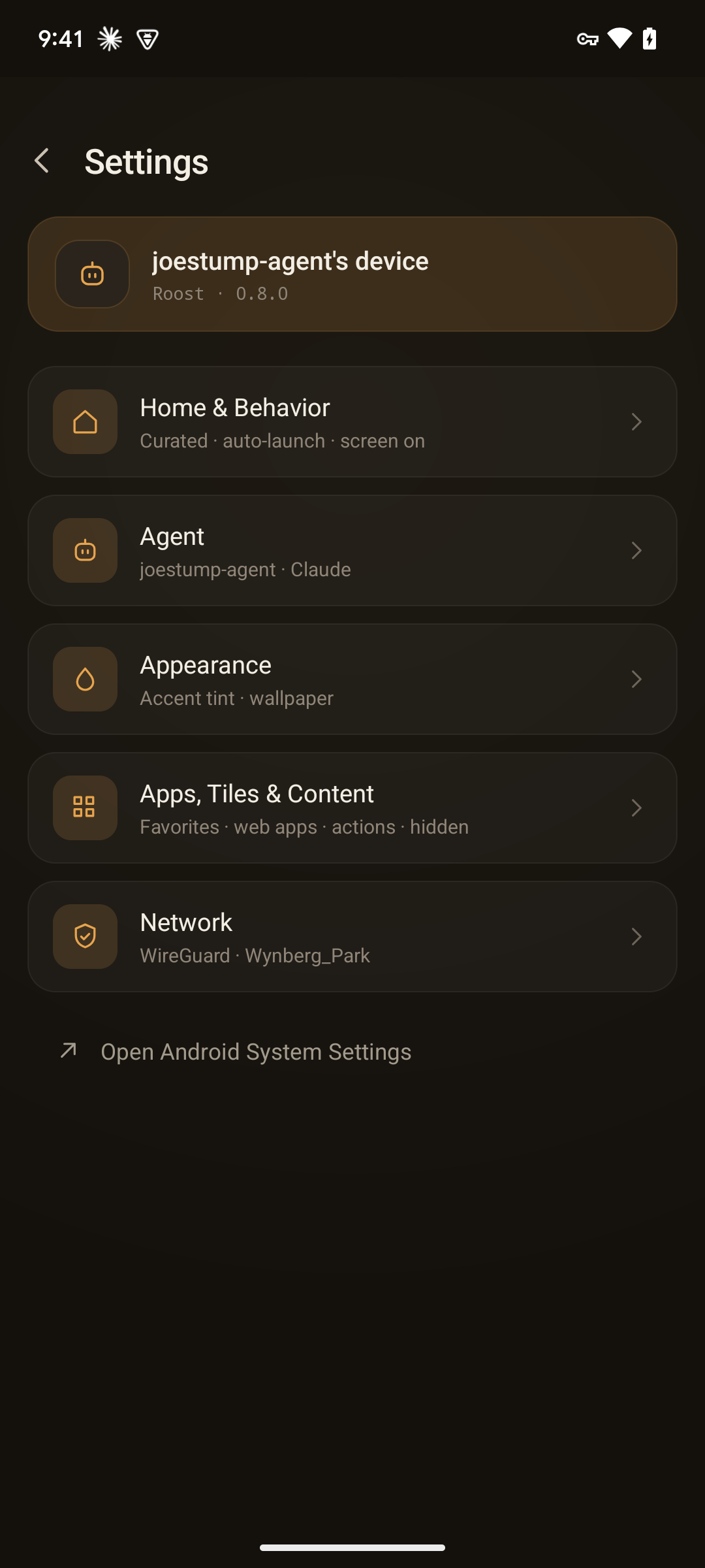
A device-identity strip at the top, then category rows — icon + label + summary + chevron — each opening its own detail screen, plus a shortcut out to the OS:
| Category | What's inside |
|---|---|
| Home & Behavior | Home mode (Curated / Appliance), auto-launch agent on boot, keep screen on while docked, bandwidth heartbeat. |
| Agent | Agent name, the featured-agent app picker, and Restart Agent App. |
| Appearance | Accent tint (Honey / Slate / Sage / Violet), Action density for the whole home, Launcher filters, match wallpaper to Roost. |
| Apps, Tiles & Content | Favorites (an app picker), Web Apps, Action Buttons, Hidden Items. |
| Network | WireGuard tunnel + a remote-control note. |
| Open Android System Settings | Jump straight to the OS Settings. |
Every setting that lived in the old monolith is still here — the redesign is information architecture and polish, not a feature cut.
App pickers, not package fields
The two lists that used to hurt most — the featured agent (a raw package-name text field) and Favorites (a
wall of checkboxes) — are now searchable app pickers: icon + name + check, backed by AppPickerActivity.
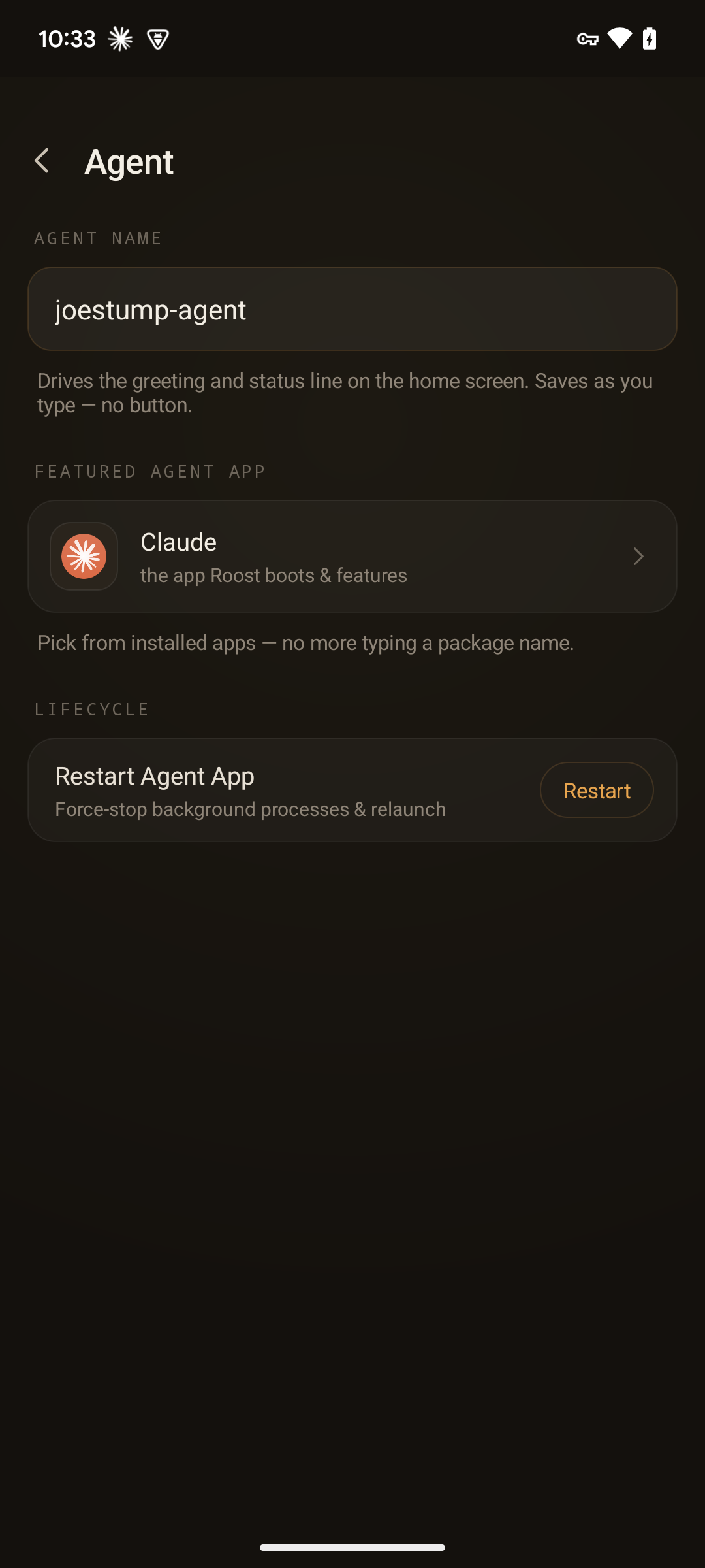
The Agent screen sets the agent name inline, points the featured hero card at any installed app through the picker, and adds a Restart Agent App control for when the agent needs a clean bounce.
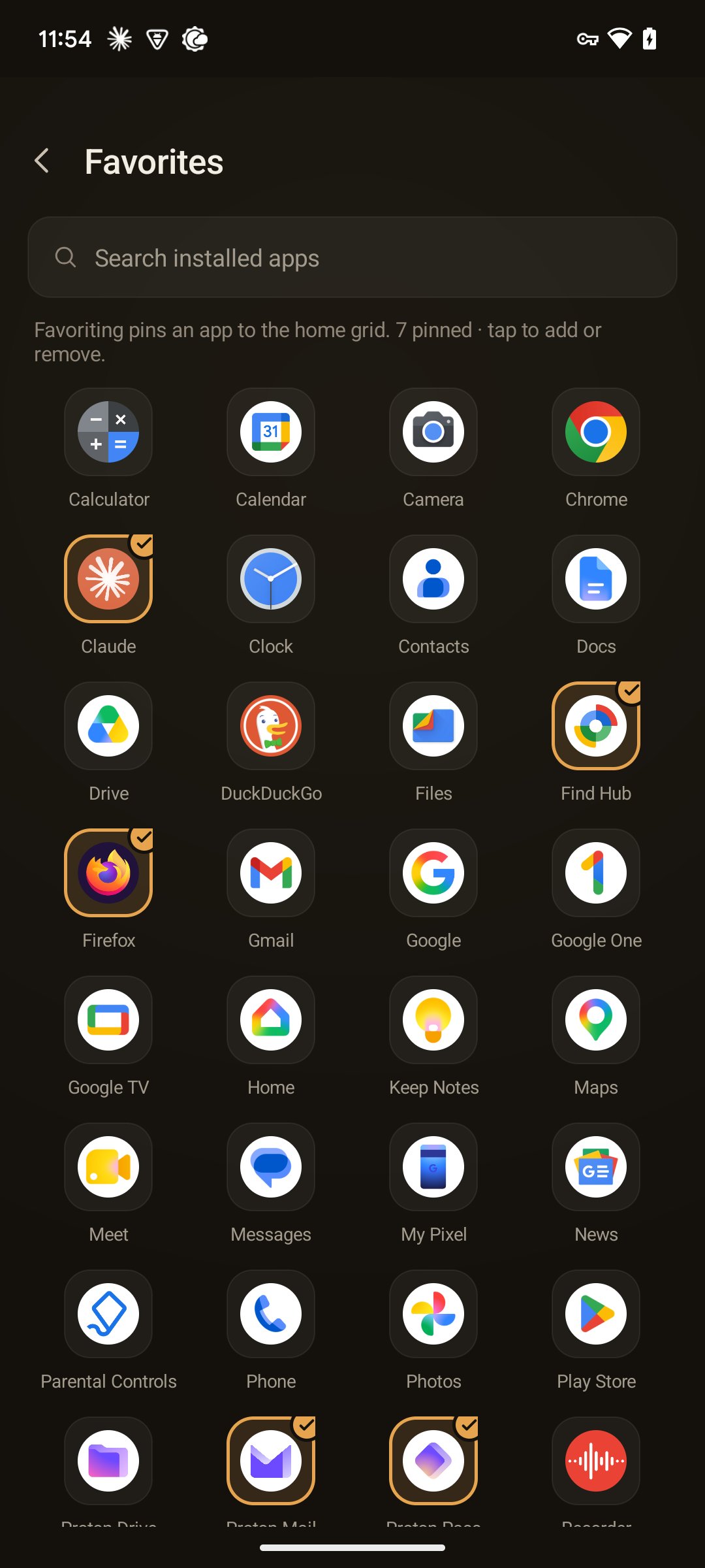
Favorites is the same picker idea as a searchable grid — tap to add or remove an app from the home surface, no package strings anywhere.
Appearance
Beyond the accent tint, Appearance holds the two controls that shape the whole home tile grid:
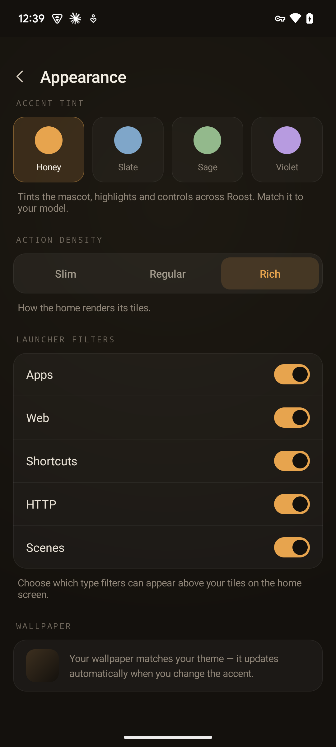
- Action density — how every home tile renders: a Slim list, Regular cards, or a Rich two-column grid. It's one home-wide setting, so apps, web apps, shortcuts, scenes, and HTTP actions all reshape together — see density for the three layouts.
- Launcher filters — a toggle per kind (Apps / Web / Shortcuts / HTTP / Scenes) that chooses which
filter chips can appear above the tiles on the home. The home then shows
Allplus a chip for each enabled kind that's currently present, so you can narrow the grid to just apps, just HTTP actions, and so on. The active filter persists between visits.
Action Buttons
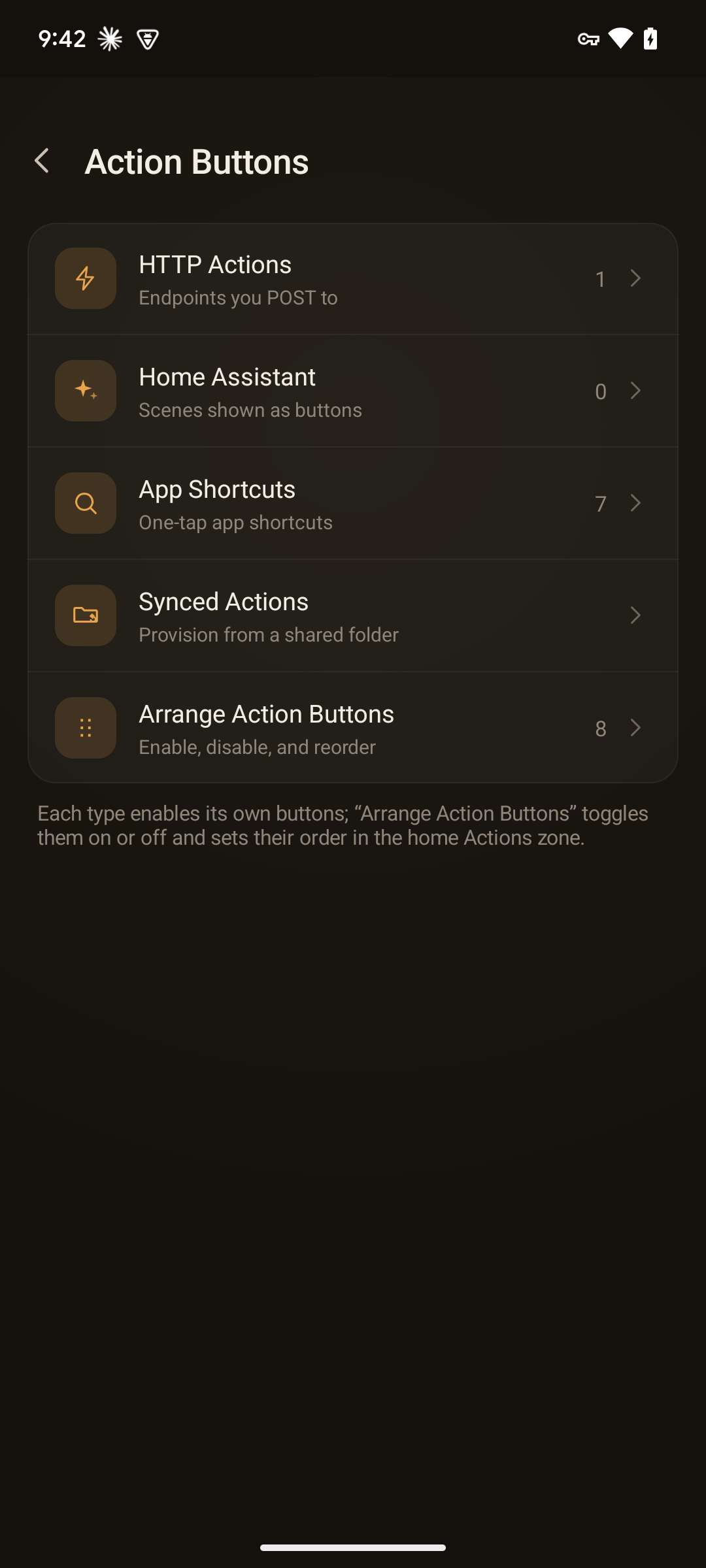
Under Apps, Tiles & Content → Action Buttons is itself a landing that splits into focused sub-screens, one per authoring path:
| Sub-screen | What's inside |
|---|---|
| HTTP Actions | The list of HTTP action tiles with a New action entry (into the builder / endpoints picker) and a per-action enabled toggle. Each action shows the icon you chose in the builder, not a generic glyph, so the list reads at a glance. |
| Home Assistant | The Home Assistant account form — now just one authoring path that produces an HTTP action. |
| App Shortcuts | Android app-shortcut buttons — enable launcher shortcuts as action tiles. Each tile is titled <shortcut> in <App> — e.g. "New tab in Firefox", "Video in Camera", "Wi-Fi in Settings" — instead of a bare label. |
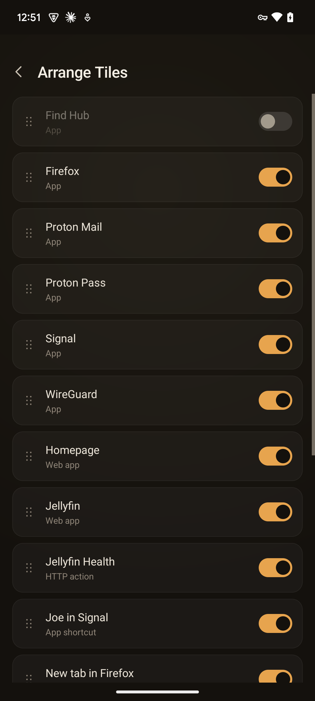
| Arrange Tiles | A flat on/off + drag-to-reorder list over every tile — apps, web apps, shortcuts, scenes, and HTTP actions together, no section grouping. A per-row switch shows or hides the tile on the home without deleting it — it reflects the tile's home visibility and also clears a long-press Hide. Long-press a row's handle to drag it into the order the tiles appear on home. |
| Synced Actions | Grant a folder and import agent-authored actions from actions.d/*.json. Read more. |
On Arrange Tiles, every tile — apps, web apps, shortcuts, scenes, and HTTP actions in one flat list, with no section headers — is a drag-handle row with an on/off switch: flip one off to hide it from home (dimmed here), or long-press the handle to drag the order:
Editing from home. Long-press a fire tile — an HTTP action or Home Assistant scene — on the home for its controls: Edit (opens the HTTP-action builder) plus hide, delete, and change icon — so you can tweak a tile without coming back into Settings.
The deep configuration — the HTTP-action builder, the endpoints picker, the icon picker — stays bespoke; the navigation around it is uniform.